Cogito Brand Identity Refresh
The largest project I took on at Cogito, was been the brand refresh. I was excited about what this brand evolution could look like. As a company, emotional intelligence was a top company priority. With that said the restrictive blue color palette, and the usage of outdated stock photography didn’t say that to the market.
Within my first 8 months with the company, I successfully developed, designed, executed, and launched the new Cogito brand. This included a new logo, color palette, company fonts, photography, icons (for marketing purposes and in the product), presentation templates, email marketing, and in-office branding.
A Clean, Modern, and
Human-Centered Brand Identity
My initial thoughts when seeing the logo was that while I see that the icon is supposed to represent vocal waves, it looks like the waves are talking at each other and creating ‘sound confusion’. I knew that I wanted to design a logo that incorporated an identifiable element into the wordmark while still keeping the logo clean and uncluttered.
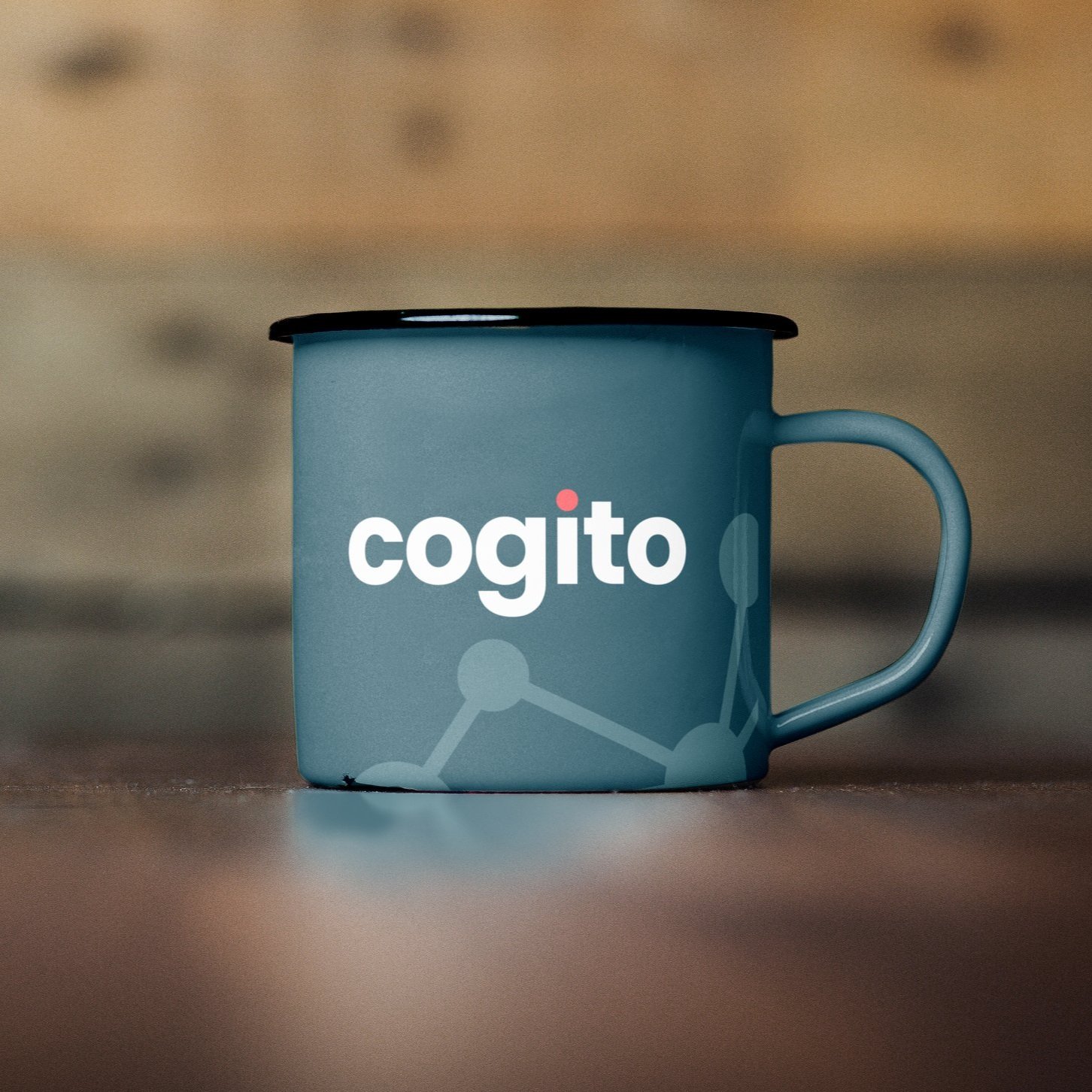
The logo is now more human-centric. The “i” represents the human at the center of Cogito’s (and our clients’) business, while the dot represented in our candy pink, we draw the eye to the brand element and center the focus.
Humans connected,
a secondary element
With the dot of the “i” representing humans, the network graphic takes on a more specific meaning as a secondary element that can represent human connections fostered
by Cogito.


Corporate and Tradeshow Materials
By using clean graphics, it has allowed elements to pop when needed, i.e. the logo on the business card, or the messaging in the banner. By toning down graphics that can distract, using our network graphic allows us to use it as a branding element that is a common thread - from corporate identity and trade show materials.
Corporate swag
How we represent ourselves as a company outside of the office is just as important.


Elevating the Human Experience: Through Color
This color palette brought the warmth Cogito needed. Adding in a warm blue/green as the primary color combines stability, trust, and confidence with growth and freshness. This is the anchor color keeping us consistent across all channels. The remaining colors will be used in conjunction with our anchor, which is also warm - and brings the human element that Cogito was currently lacking.
A Diverse Palette, is a Happy Palette
The original color palette was incredibly limiting. Adding a secondary palette that included light, medium, and dark tones in an array of colors, allowed Cogito to show variations, represent their data clearly, and an opportunity to align the palettes of product and brand.
One important thing to mention is that ALL colors in the newly expanded palette were tested and are ADA compliant.
A New Font That Shows That Cogito is Friendly and Approachable
The primary font is Poppins, and the secondary font is Roboto.
Why these were chosen:
Both are Google fonts (this will help with future localization)
Elevate Cogito as a brand that is strong,
but approachableModern sans-serif
Smart and professional
Primary Font: Poppins

Secondary Font: Roboto


Illustrations That Help Tell the Story When Words Can’t
What’s great about Illustration is that it has the ability to reimagine reality in a way that is familiar yet delightfully uncommon, which makes it particularly useful when an idea is difficult to explain.
It gave us the ability to unfold our brand story with consistency on multiple platforms (web, print, social, etc).
A Simplified Icon Style
Using a flat, simplified icon style, we’ll have an icon library without a lot of fuss and embellishment. It allows users to quickly understand what we’re trying to convey
without working too hard.


Authenticity Through Diverse and
Inclusionary Photography
Stock images in design have power: the experience of seeing someone like you reflected back in an image is empowering. It fosters inclusion and increases awareness. It’s important that our photography reflects the people who are using Cogito.
Bringing the Brand to the Office
You have one chance to make a first impression. Why not make it a great one?


